ANTIBLANKS
2022 - present
As the UX/UI designer, the Antiblanks website redesign project would involve a comprehensive process of understanding the goals, needs, and expectations of the stakeholders and the target audience to deliver a visually appealing, functional, and user-friendly website.
Role
UX & UI Designer
UX Researcher
Introduction
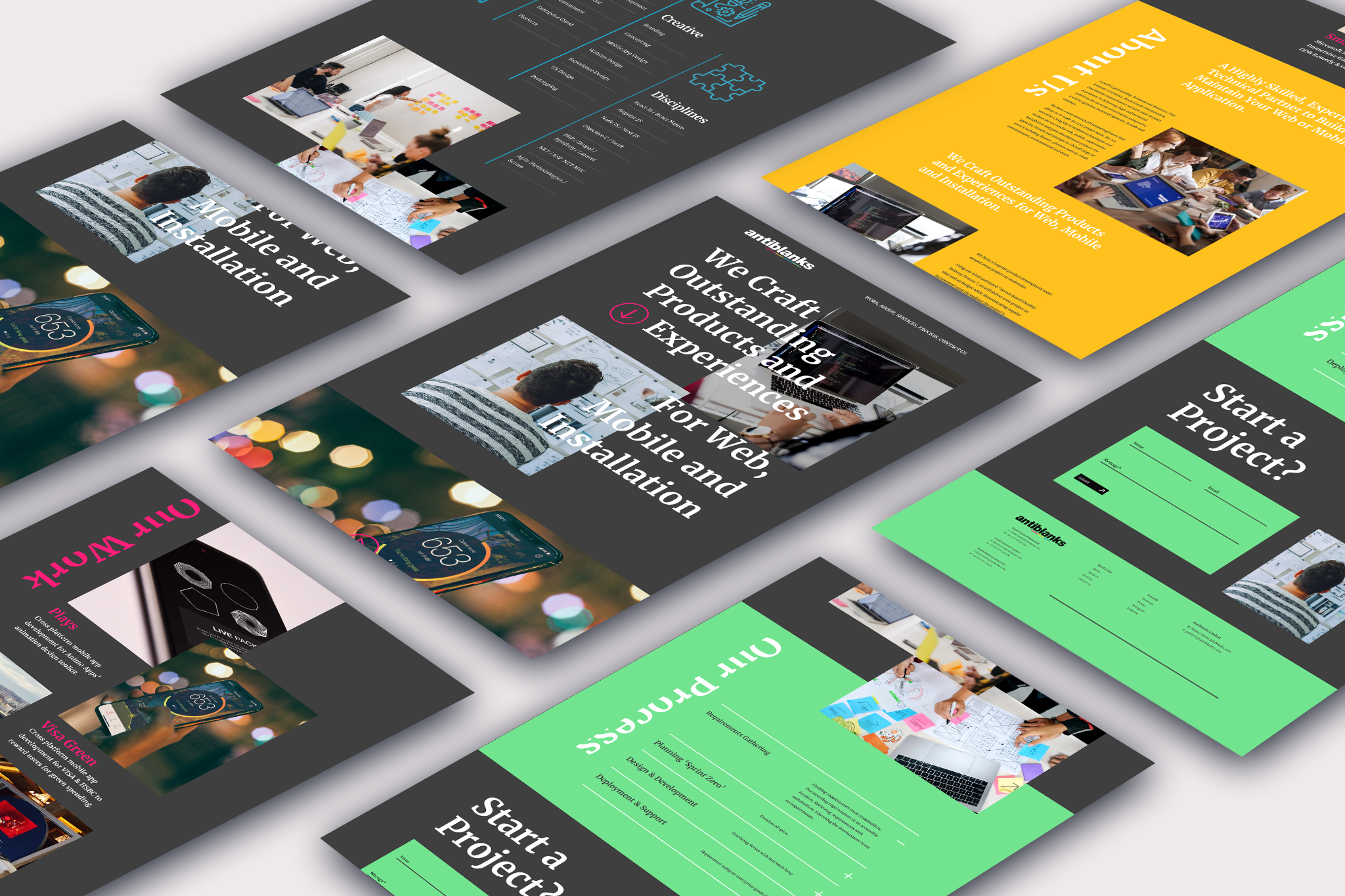
I was tasked to design the website by the creative director to make the website more modern and chaotic in order to install the brand identity more into the website. Antiblanks is a company that takes risks in all aspects of its products and we wanted to test the limit of design rules to create a website that dares to break the norm in design. The agency has a unique brand identity that is edgy, modern, and vibrant, and it was important to reflect this in the website's design. To accomplish this, I first worked closely with the Antiblanks team to understand their values, vision, and goals for the website. We identified the key features and functions that would be required, as well as the visual aesthetic and tone that best represented their brand.
The problem
One of the primary challenges was creating a design that accurately reflected the brand's identity while still being user-friendly and accessible to visitors. This required finding the right balance between creativity and usability, making sure that the design did not overwhelm users or interfere with their ability to navigate the site. Another challenge was the need to create a responsive design that would work well on a range of devices, from desktop computers to mobile phones. This required careful attention to the layout and design of the website, making sure that it adapted smoothly to different screen sizes and orientations.
Finally, there was the challenge of creating a design that would stand out in a crowded digital marketplace. This required careful consideration of the latest design trends and technologies, as well as a deep understanding of Antiblanks' competition and target audience. Despite these challenges, we were able to create a design that successfully represented Antiblanks' unique identity and values, while also delivering a user-friendly and engaging experience for its visitors. The project was a success, and the website has helped to establish Antiblanks as a leading digital agency in the industry.
Design Expolration
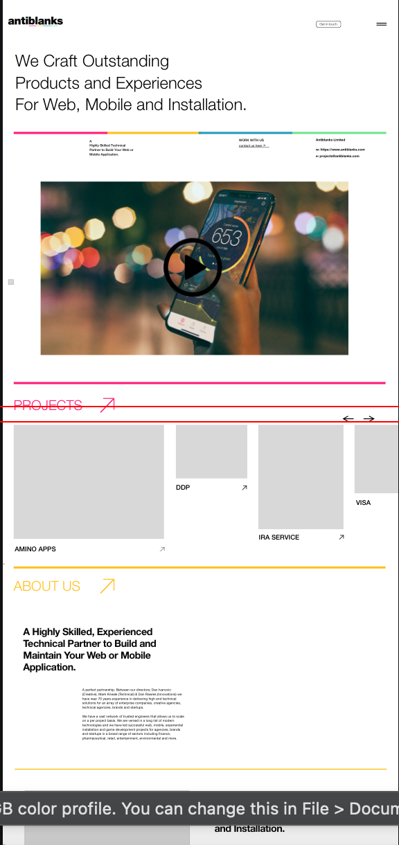
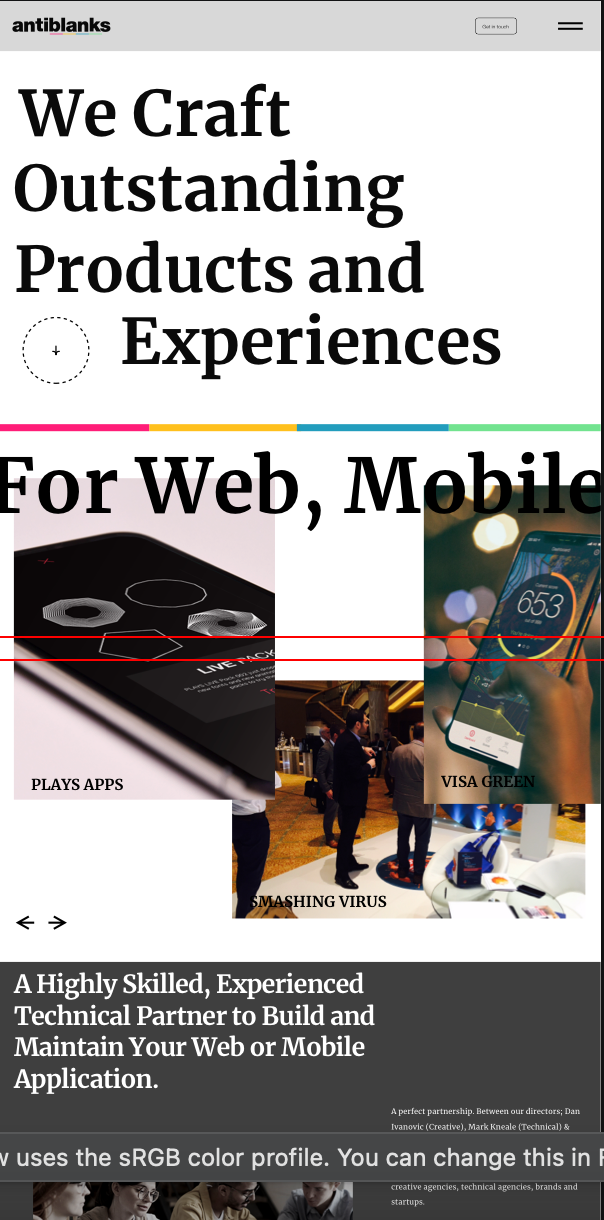
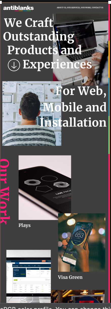
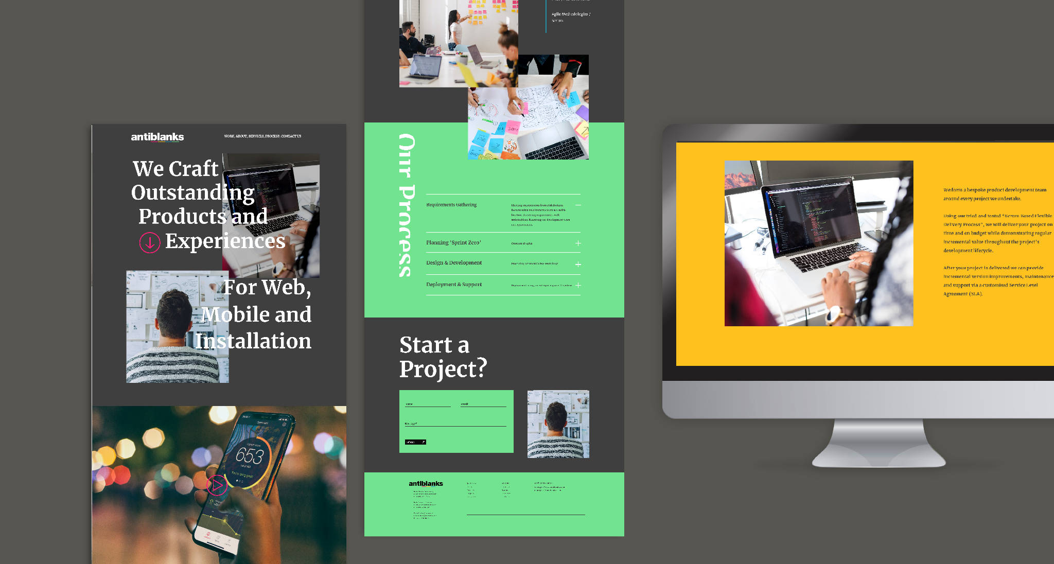
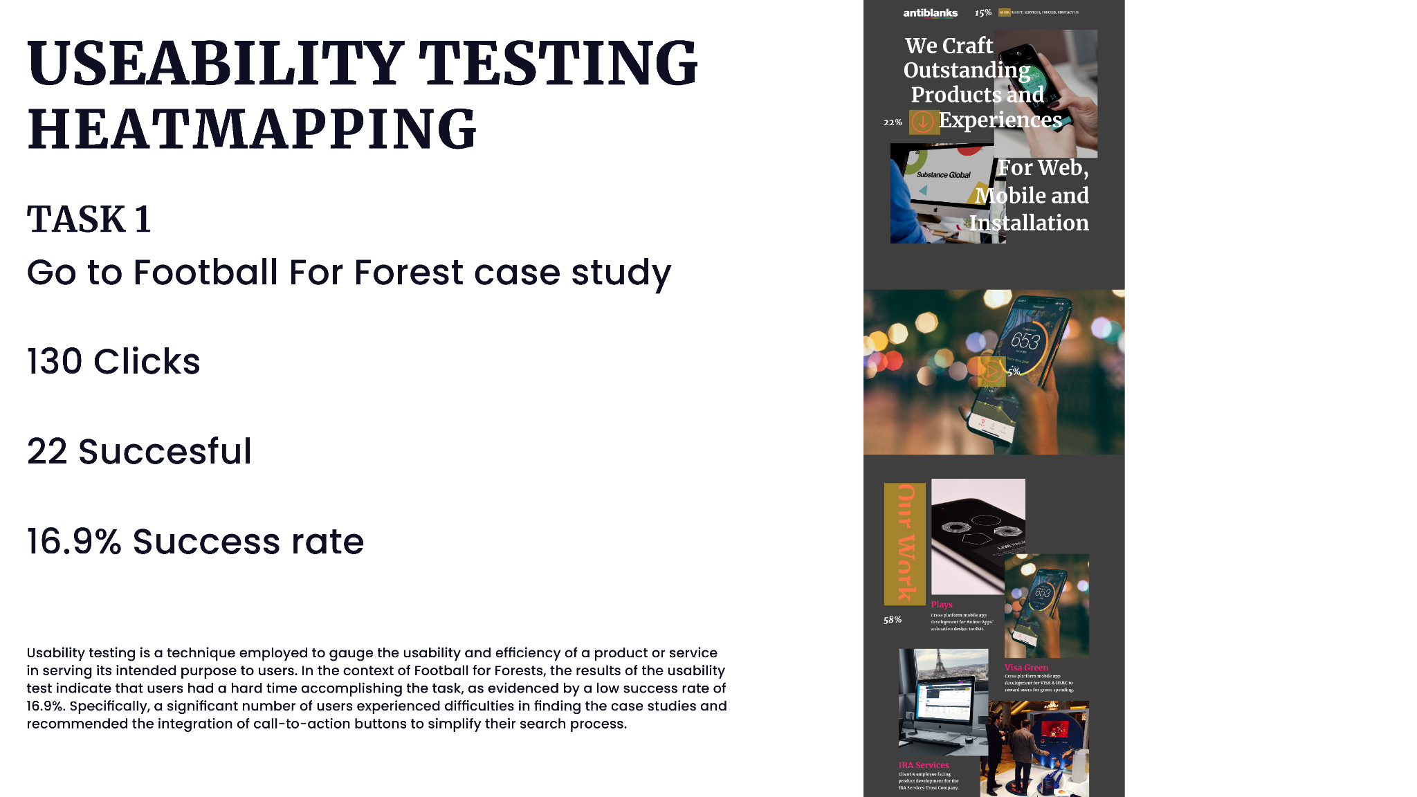
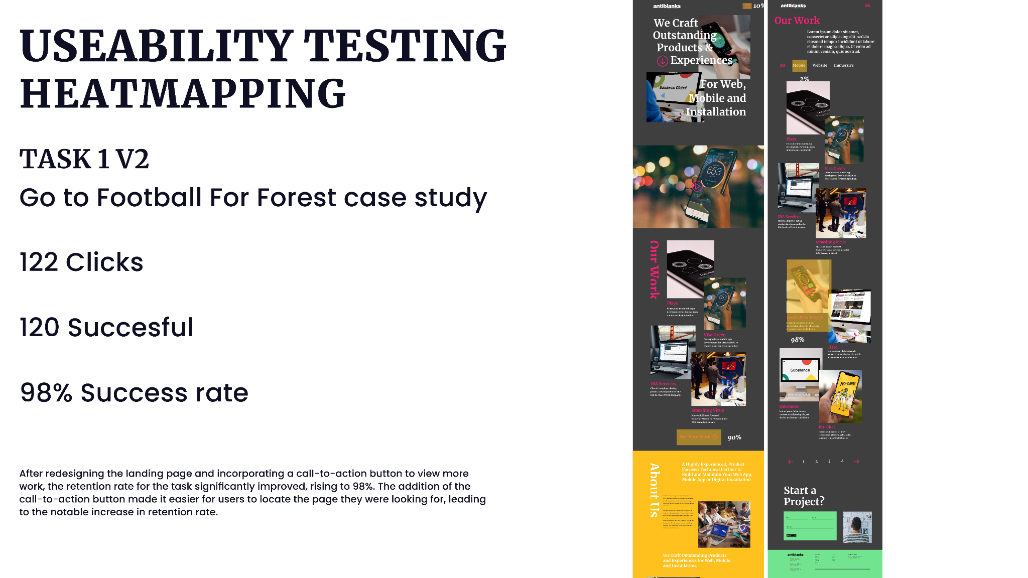
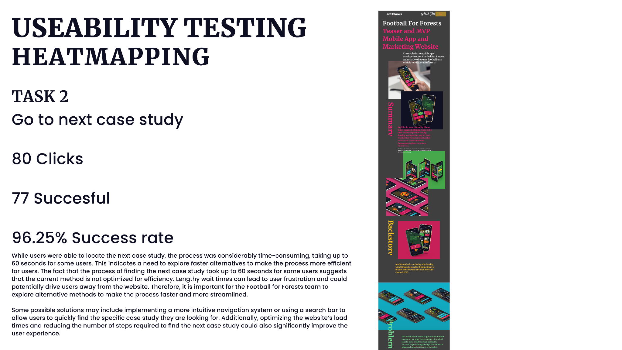
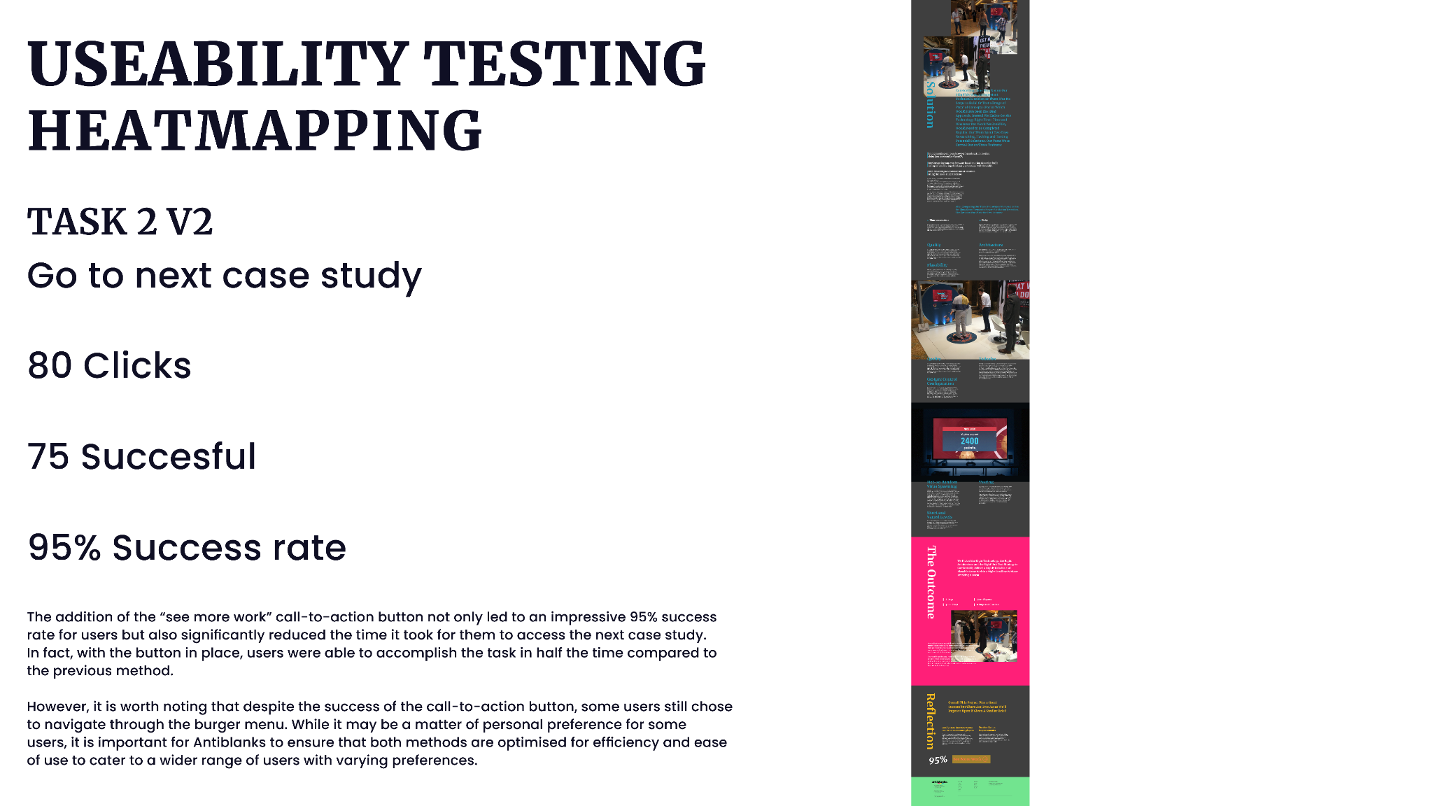
I began the design process, creating wireframes and mockups that incorporated bold colours, dynamic typography, and eye-catching visual elements. I ensured that the design was not only visually striking but also user-friendly, with intuitive navigation and clear calls to action.
Throughout the design process, I kept the target audience in mind, understanding that they were looking for a digital agency with a fresh and innovative approach. The website needed to showcase Antiblanks' work and expertise while conveying their unique personality and voice.
I was experimenting with different layouts and with different design styles. I wanted to try different things with the brand identity to make the website as unique as possible. During the research, I was looking at different eras in design from Art deco to current modern design styles. I was heavily influenced by Swiss design in the process of creating the website.
The Solution
To address the challenges faced when designing the website for Antiblanks, I employed a number of strategies and solutions. To balance creativity and usability, I worked closely with the Antiblanks team to understand their brand and target audience, and to identify the key features and functions that would be required on the site. I then used this information to create a design that was visually striking but also easy to navigate and use.
To ensure the website was responsive, I employed a mobile-first design approach, starting with a layout that worked well on smaller screens and then expanding it to larger devices. I also used a range of design techniques, such as flexible grids and responsive images, to ensure the website was optimized for a range of devices.
To make the website stand out in a crowded marketplace, I incorporated the latest design trends and technologies, including bold colors, dynamic typography, and interactive visual elements. I also paid close attention to the user experience, making sure that the website was optimized for speed and performance, with clear calls-to-action and intuitive navigation.
Overall, the solution was to create a website that accurately reflected Antiblanks' brand and values, while also delivering a user-friendly and engaging experience for its visitors. By employing a range of design strategies and solutions, we were able to create a website that was responsive, visually striking, and optimized for performance, helping Antiblanks to stand out in a competitive digital marketplace.